

What we can learn from the trash heap of The Drudge Report and why it matters
This incredibly basic website is a masterclass in the “economics of attention”

Welcome to Teach, Delight, Move—a newsletter about the crying need for eloquence and wisdom in a world dominated by bureaucrats, AI, and bureaucrats now using AI. Today’s article comes to you free of charge. If you like what you read, please consider becoming a free or paid subscriber. Every now and then I feel like I’m sitting cross-legged on a street corner playing a guitar with a little hat. If this article makes you laugh, chortle, guffaw, ponder, wonder, contemplate, or cackle, you can show your appreciation by dropping a dime in my cap (or by liking, commenting, subscribing, sharing, restacking). Enjoy the show.

Imagine you’re an archaeologist living 500 years in the future.
You’re interested in inspecting what used to be a gigantic garbage dump.
You know you can learn a lot about how people lived by picking through their trash.
“Interesting,” you might say, “Not so many baby diapers here. They must have deliberately limited their children. Or had none at all. Or found some other way of catching their offsprings’ feces.”
You don’t want to jump to conclusions too quickly.
Or, you may exclaim, “Look at that! They used to wrap their trash in white or black plastic bags. Strange. Why not purple bags? And did they really design these things just to be thrown away?”
You might find a whole lot of one gallon milk containers. Some might have labels like “Raw Milk – Not For Human Consumption.” “Raw milk? What’s that all about?” you may wonder. “What makes it ‘raw’? And if it wasn’t for human consumption, what was it for?”
We’re going to puzzle a lot of people in the future.
Or you may find some waterlogged snail mail promotions for pressure washing companies and window cleaners. “Weird,” you think. “Nobody takes the trouble to clean things anymore. AI does that for us (so we can make art all day).”
The point here is that you can learn a lot about a culture through its discarded waste.
What I want to focus on now is what we can learn from one of the Internet’s largest digital trash heaps: The Drudge Report, a news aggregating website that consists almost entirely of headlines (that double as links) and images. In what follows, I’ll be digging through the trash (yesterday’s news) to discover something about how we consume “stories” online.
Now, before you go thinking I’m some sort of “judgy” elitist who sneers at popular culture and what the average folk read, you should know that I have a bad habit of reading The Drudge Report. It is my guilty pleasure. It is what I automatically type in to my smartphone’s browser when I have five seconds of spare time and my wife isn’t looking.
The impulse to check The Drudge Report is lodged somewhere deep in my reptilian brain, or somewhere, perhaps, near my pineal gland (around where Descartes thought the soul resided).
I, too, am guilty not simply of rifling through the trash but of consuming it regularly.
What is The Drudge Report?
Matt Drudge, who used to dress (and still dresses?) like what you think a journalist would look like from the 1930s, started The Drudge Report as an email mailing list. Here’s Matt with his signature fedora:

.jpg)
In March 1995, Matt Drudge had 1,000 email subscribers. I’m not sure precisely when he switched from an email list to a website, but the earliest entry on Archive.org is for December 6, 1998. If you were to look at the home page back then:
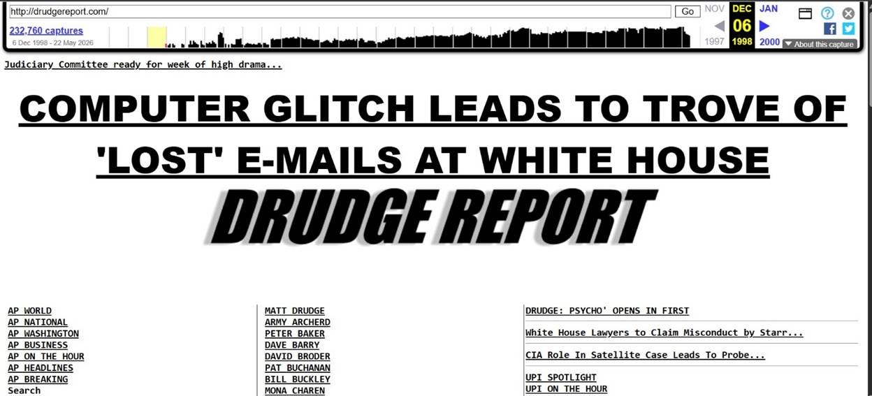
And if you were to compare it to today:

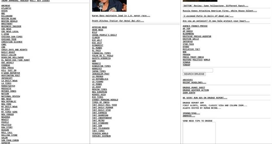
You’d find that the site looks basically the same.
Can you think of any other website that has not changed its design in nearly 30 years of operation?
This archaic, basic HTML web page dating back from the era of Hamster Dance must not get any attention, right? It just looks so…. old.
As of May 15, the site had 25.6 million visits in 24 hours, a statistic you can learn on the home page itself by scrolling to the lower right-hand corner.
Algorithmic sleights of hand invisibly dominate the majority of our online experience today. Cookies track us everywhere. AI has been recommending us products and movies for years on Amazon and Netflix. The algorithmic sands shift under our feet, and we don’t even realize it. We think we’ve found what we were looking for, whereas in reality it found us—having tracked us from the distant corners of the web much like murderous AI dogs will do in the future.
But The Drudge Report doesn’t do any of this, as far as I can tell. It does not rely on any algorithms to display content. Some human, somewhere, made the editorial decision to include any given link.
Now, many things make The Drudge Report a fascinating artifact to contemplate in terms of what it can teach us about how formatting, images, and headlines interact to grab, hold, and dominate attention.
Subtle Blows to the Scanning Eye
For the purposes of this studious dumpster dive, I want to begin by focusing on the arrangement of the elements on the page.
Observe the upper left-hand corner:

Typically, Drudge includes at least one if not multiple headlines in the upper left-hand corner.
Why begin in the upper-left hand corner? Well, that’s where the reading eye always begins. We’re talking about hundreds of years of convention here. Every time you open a book, whether it is Llama Llama Red Pajama or the Book of Ecclesiastes, you just expect the words to begin in the upper left-hand corner of the page.
Your eye just automatically goes there. This is not a conscious decision. This is how things work if you can read English.
This convention differs by culture, of course.
You read Arabic script from right to left—not left to right like the phonetic alphabet. If The Drudge Report was aimed at an Arabic audience, you could probably guess where this first headline would go: the upper right-hand side.
After this first little headline, the impatient eye heads straight for the center:
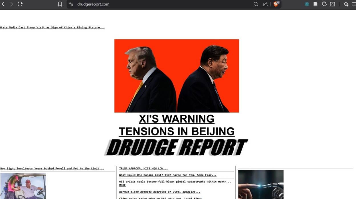
In the center, we find the largest image on the whole page. It is not too large. But it is large enough to steer your eye. It is also rectangular (as opposed to square like the other images below).
Notice how much white space there is on the left and right side of that main image. That white space, whether you realize it or not, functions like a vortex to suck your attention right out of your skull in a fraction of a millisecond.
You may as well be seated in the exit row of a commercial airliner 35,000 feet up. The emergency hatch flies open. You didn’t happen to have your seatbelt fastened (you ignored the sign, you fool). Are you still in your seat? Exactly. You didn’t have a chance.
That white space is the pure and undiluted oxygen that pacifies your frenetic attention as you scramble around the Internet clicking and clicking and clicking. The white space here is the pause between the dopamine hits, the exhale necessary to get the carbon dioxide out of your system so you can breathe in some more “content.”
Drudge feels no horror vacui, the fear of empty space.
I’ve been tempted to compare The Drudge Report to an old-time tabloid (compare the site’s design to the cover of People magazine and you’ll see what I mean). There are a number of similarities that I will not focus on here. But one major difference between The Drudge Report and old-time tabloids lies in this willingness to admit empty space, especially around the main headlines and primary image.
All the Faces Look the Same
As we scroll down the page, we notice a few other curious things.
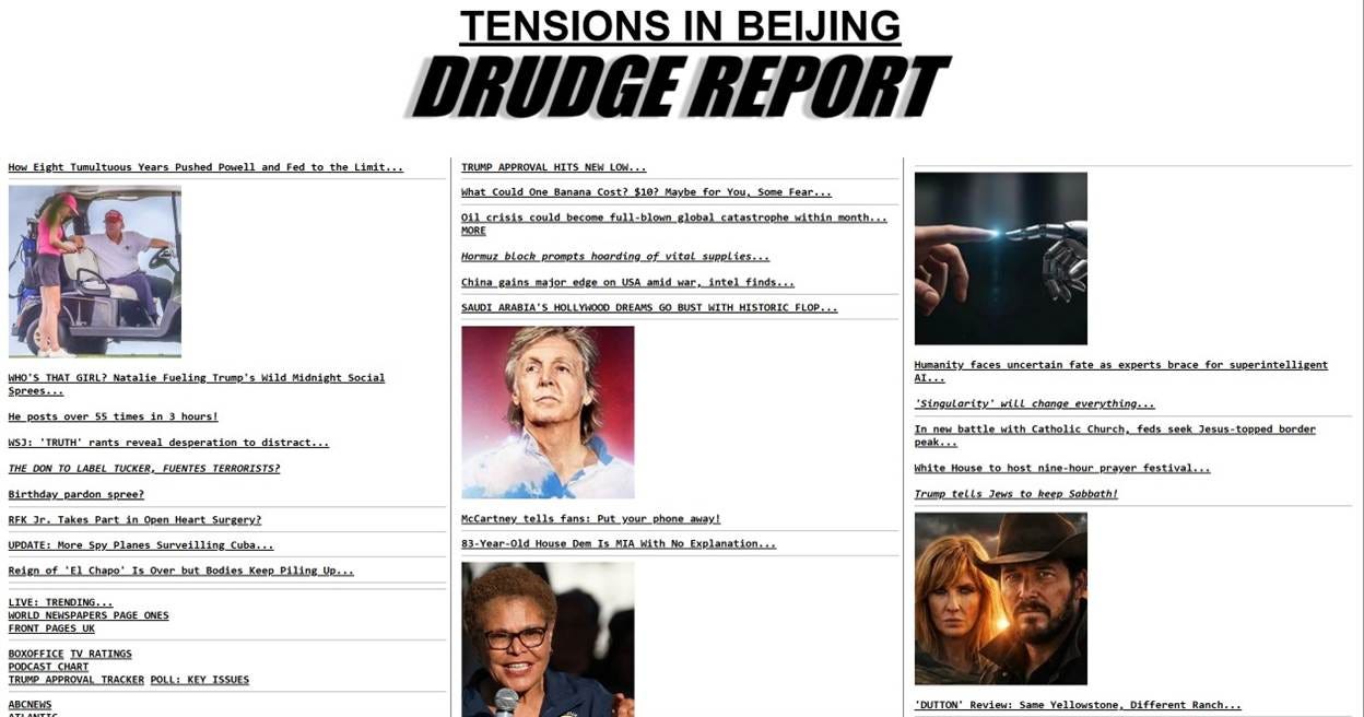
There are these tiny, gray, nearly invisible dividers that section off groups of headlines into mini narratives. The following group of headlines, set off by these gray threads, all revolve around The Don:

The goal of these tiny dividers is to direct attention and to disappear in the process.
There are five to eight smaller images with a square aspect ratio. If it is a picture of a person, it is almost certainly a picture of their face (or something more salacious, if necessary). Count the faces:
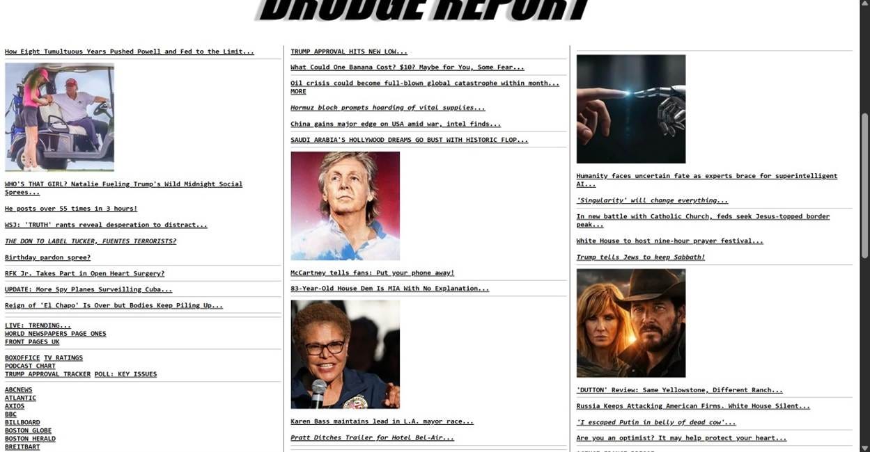
Why faces?
The face is the most mysterious and vulnerable part of the human body. The face is as close to pure expression that an embodied creature can get. The face speaks even before opening the mouth. The face will always catch the eye, which is why we see faces even when there are none, even in words themselves (they’re called fontfaces after all).1
Some headlines are written in ALL CAPS, the visual equivalent of speaking in a louder voice (i.e., yelling).
And some headlines have ellipses at the end……….
Why do they have ellipses at the end……?
Why don’t you read on to find out…..?
Headlines Have Consequences
The most obvious use of rhetoric on The Drudge Report has nothing to do with the formatting or images, per se, but with framing. Every rewritten headline is an angle on reality, a particular spin, an emphasis.

“Xi’s Warning” links to an article whose original headline is “China’s terrifying WW3 ‘come into conflict’ warning to Trump over Taiwan.”
“Tensions in Beijing” leads to another with the following headline: “Xi’s Taiwan Warning to Trump Highlights Tensions in Beijing Summit.”
These rewrites take already sensational headlines and package them up for maximal effect. It is like if you used processed food as ingredients for more processed food. And, what is more extraordinary, is that these deep-fried headlines create an extraordinary appetite in the viewer (again, I am no exception).
“Xi’s warning… what warning?”
“Tensions? What tensions? I didn’t know there were tensions.”
You basically have no choice. If you read those headlines, you have to click.
As Kenneth Burke understood long ago, the key to great art lies in its ability to create and satisfy an appetite. While absolute trash, The Drudge Report is also fine art. Don’t go with painting as your metaphor for fine art. Stick with cuisine.
The Drudge Report is a menu.
Every link is something to consume, carefully crafted to create an appetite.
The satisfaction comes only from clicking.
To understand the powerful pull of these headlines, imagine being forced to read The Drudge Report for every minute of your waking life but being unable to actually click any of the links.
The same thing we can say about headlines and their power to create an appetite relates exactly to the appeal of the ellipses, a signal to the reader that there’s more to know if you’re only willing to click to find out….
The End
We could keep scrolling down the page to talk about other elements and how they function, but I don’t want to belabor the point.
Please take note. Throughout this entire analysis, you’ll notice that I haven’t once focused on the what, per se. My primary focus has been on the how: how Drudge structures headlines, how the dividers work, how most of the images are of faces, etc. I haven’t talked about the appeal of specific headlines or faces, though that’s important, too.
Also, I took all the screenshots above in a browser (Brave) that blocks ads. Here’s the top of the page with ads:

Now you know how Drudge makes money.
My focus here has been specifically on the form of the website.
And that’s why what you have just read is not some sort of psychological or statistical or scientific analyses but a rhetorical criticism, for rhetoric takes seriously not simply the what but also the how (and their essential inseparability).
Attention is the scarcest resource of our day, or so says rhetorician Richard Lanham, and The Drudge Report is a masterclass in the “economics of attention.”
Moreover, this website is exemplary insofar as Drudge (or whoever runs the site nowadays) doesn’t really write anything original. Wikipedia claims that Drudge occasionally writes stories, but that’s not what draws and keeps people on the site.
Most everything you find there is a repurposed link from somewhere else on the web. Literally, everything you find there is “recycled.” So, perhaps the metaphor of The Drudge Report as trash isn’t quite appropriate. But it is close enough.
For the observant (and ironic) reader, you will have noticed that I’ve made lemonade from the lemonade that Drudge has made from the lemons that he has discovered.
Otherwise put, Drudge recycles trash to make his own trash so that I can make trash from Drudge’s trash.
That’s how the Internet works. If you don’t get that, you’re just not paying enough attention.
LIKE, SUBSCRIBE, DONATE, BUY ME COFFEE, BUY ME LAND
If you liked this article, you might also like:
“It’s a Tool, It’s a Medium… It’s a Bomb?” - A Response to Roy and Stephenson on Our Metaphors for the Internet
“Aquinas and the Black Box: A Short Quiz” - Some say Aquinas would have used AI. I made a short quiz to determine whether they’re right.
“AI and the Tech Idiot Framework: Predicting the Future” - Friends don’t let friends say technology is neutral and all that matters is how you use it.
For more on the face, see Emmanuel Levinas or Abraham Heschel.